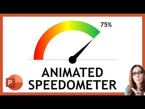
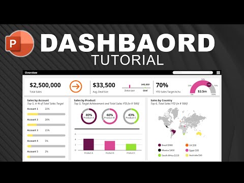
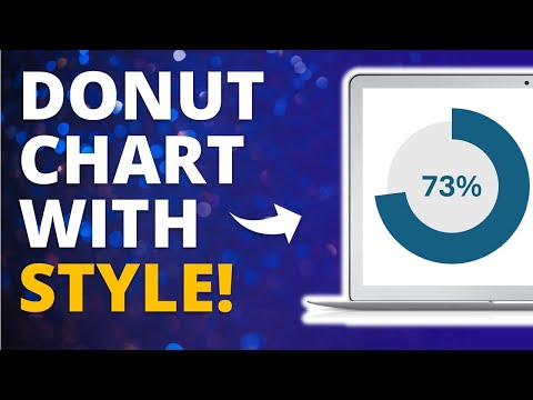
Transform Your Data with Stunning Gauge Charts in PowerPoint ✅Complete charting reference: A Gauge Chart looks like a speedometer and is used to display values within a range like showing performance, progress, or key metrics. Unlike bar or line charts, gauge charts provide a quick, intuitive way to track performance against goals. In this video, you will learn how to create a professional Gauge Chart in PowerPoint from scratch. We’ll cover: - What a Gauge Chart is and why it’s effective - Benefits of using gauge charts for reporting and dashboards - Step-by-step instructions to design one in PowerPoint By the end, you’ll be able to create visually striking gauge charts that make your data more engaging and impactful. 📋Mastering Shapes: ⏰Timestamps: 00:19 - Definition and Benefits 01:51 - How to Create a Gauge Chart 07:23 - Customize Gauge Chart 🔔 Subscribe for more PowerPoint tips: @StrongSlides 💬 Don’t forget to comment 🙋Consider becoming a member for more perks and to help this channel grow. ⬇️Download:
- 966Просмотров
- 3 месяца назадОпубликованоStrong Slides
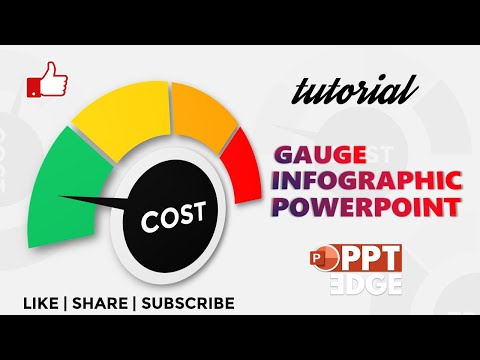
How to Create a Gauge Chart in PowerPoint | Step-by-Step Tutorial
Похожее видео


Популярное
Новини