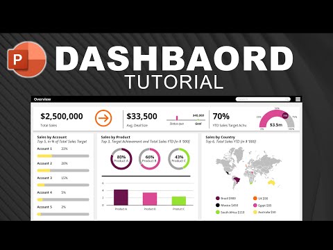
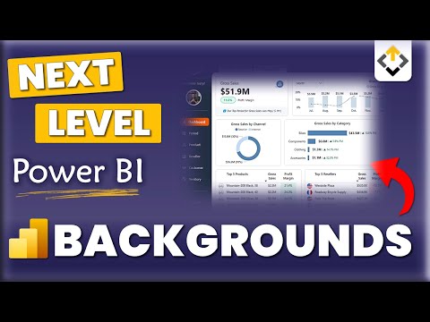
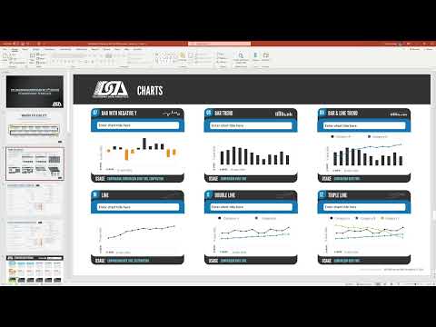
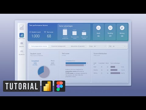
Before jumping straight into Power BI or Excel, creating a dashboard wireframe can save you hours of redesign, improve stakeholder feedback, and help you focus on what really matters—clarity and insight. In this tutorial, I’ll show you step-by-step how to wireframe a BI dashboard using PowerPoint. While tools like Figma, Canva, Balsamiq, Moqups, and Miro are popular, PowerPoint is a simple yet powerful way to create low-fidelity dashboard prototypes that guide your design process. Work With Me I help businesses and individuals make sense of their data with dashboards, trackers, and custom solutions and excel coaching. 📩 To work with me, send a message to: 📱 WhatsApp / iMessage: +234 816 299 8619 ✉️ Email: freedomoboh123@ 👉 Perfect for anyone working with Power BI, Excel, or data visualization projects. What you’ll learn in this video: Why dashboard wireframes matter in BI projects How to find design inspiration on Pinterest & Dribbble Building a dashboard wireframe in PowerPoint Connecting your wireframe to real datapoints Importing your wireframe into Power BI and Excel for use as a background 🔗 Resources Mentioned Pinterest Inspo: Color Picker: MetisBi Article: #:~:text=Wireframes%20are%20more%20than%20just,solutions%20that%20actually%20deliver%20value. ⏱ Timestamps 00:00 - Introduction 01:20 - Wireframe Sample 02:40 - How to get Inspo for your Dashboards using Pinterest & Dribbble 04:16 - How to build a wireframe on PowerPoint from your inspo 08:43 - How to build a wireframe on PowerPoint to match your datapoints 15:41 - How to add your wireframe on Power BI (using Canva background) 16:50 - How to add your wireframe on Excel 📌 CONNECT WITH ME ON SOCIAL PLATFORMS LinkedIn: X: TikTok: @obohtt #dashboarddesign #powerbidashboard #powerbi #excel #wireframe #powerbi #powerbidashboard #dashboarddesign
- 3594Просмотров
- 2 месяца назадОпубликованоFreedom Oboh
How to Wireframe Your Dashboard in PowerPoint | Dashboard Design Tips
Похожее видео


Популярное
Новини