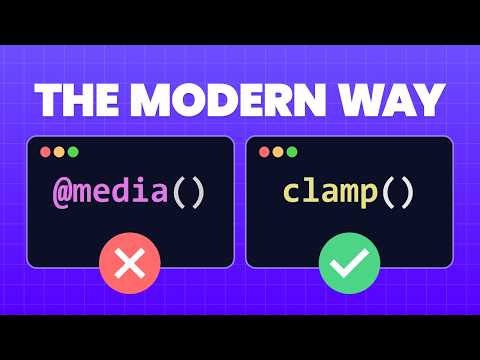
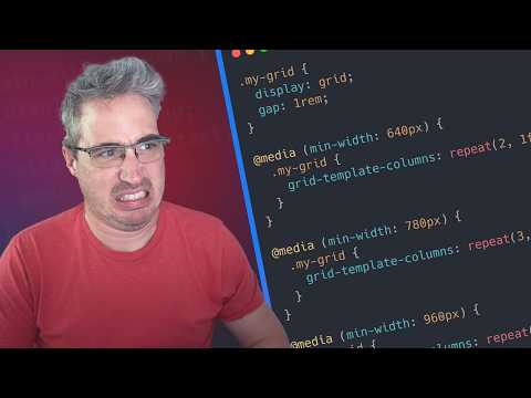
There are great tools we can use for generating responsive typography in CSS, but the result is always a clamp() function with numbers that seem somewhat mysterious. I wanted to get a more intuitive idea of what those numbers do, and how they relate – so I made a visualizer using CSS gradients! Most of the tools will start by defining a small-viewport to large-viewport range, and work backwards to get the proper offset and viewport-ratio, which makes sense from an authoring perspective. Here we can see the range being generated by the raw numbers. If the other tools are typography generators, think of this one as a typography inspector! It's here to help us understand the code that we're generating.
- 686Просмотров
- 3 месяца назадОпубликованоWinging It
Demystify responsive type with this interactive visualization!
Похожее видео


Популярное
Новини