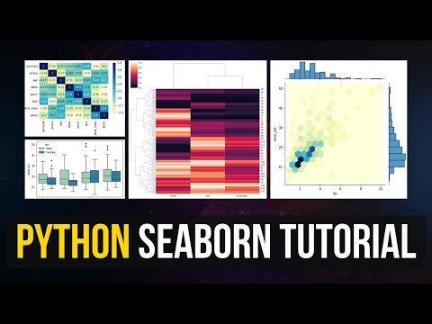
Learn how to analyze and visualize data like a real data analyst using Seaborn! In this step-by-step Seaborn tutorial, I’ll show you how to go beyond just creating charts, and actually interpret your visualizations to uncover insights from your data. We’ll cover: Creating Seaborn plots (histograms, boxplots, bar charts, line plots, heatmaps) Customizing visualizations with Matplotlib Using Seaborn to tell data stories and find real insights Thinking like a data analyst while exploring data This tutorial uses a real-world coffee sales dataset and is perfect for beginners learning Python for data analysis: Link to notebook: CHAPTERS: 00:00 Intro 00:21 Installing Seaborn 1:00 import statements + Dataset Overview 3:03 Hisotogram 06:45 Boxplot 10:05 Bar Chart + Grouped Bar Chart 13:47 Line Chart 16:23 Scatter Plot 17:11 Heatmap
- 364Просмотров
- 1 месяц назадОпубликованоData Analytics Lab
Seaborn Python Tutorial: How to Analyze Data Like a Data Analyst (Step-by-Step Guide)
Похожее видео


Популярное
Новини