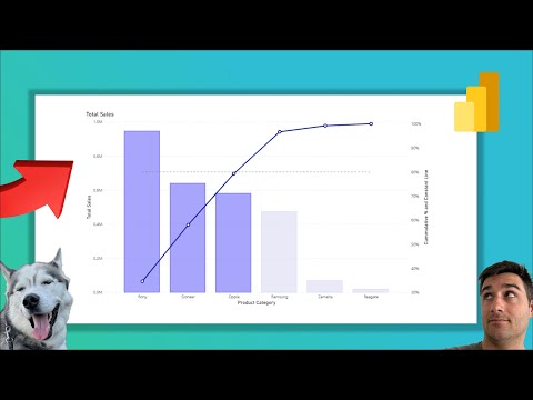
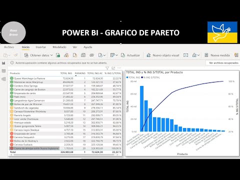
Master Pareto Analysis (80/20 Rule) in Power BI using DAX! 📊 In this quick tutorial, you’ll learn how to implement a Pareto Chart in Power BI from scratch. The Pareto Principle (or the 80/20 rule) is a powerful decision-making tool stating that roughly 80% of your results come from 20% of your efforts. Mastering this technique allows you to identify key drivers in your business—whether it's top-selling products, high-impact customers, or major causes of errors. 🔍 What You’ll Learn: The Logic: Understanding the 80/20 rule for decision making. DAX Formulas: Step-by-step creation of the Cumulative Total and Total Percentage measures. Visualization: How to configure the Line and Stacked Column Chart for a professional Pareto look. Sorting & Filtering: Ensuring your data displays correctly from highest to lowest impact. 📌 Timestamps: 0:00 - Creating the Clustered Column Chart 0:50 - Writing the DAX Cumulative Profit Measure 1:22 - Creating the Cumulative % & the 80% Threshold Measure 1:55 - Building the Pareto Visualization 2:20 - Final Formatting & Insights 🚀 Resources & Links: Step by Step Guide: Subscribe for more Power BI Tips: @PowerBIwithAkshay?sub_confirmation=1 Related Video (Power BI & DAX Tutorial): ✨Download Free Tutorial with PBIX file : Master DAX Dynamic Charts-Ranking ✨Calculation Groups & Conditional Formatting : ✨Running Totals in 5 Ways: ✨Master DAX: Blogs: @akshaymishrabi Free Access To DataCamp Power BI Courses: Portfolio here: #PowerBI #DAX #ParetoAnalysis #DataAnalytics #BusinessIntelligence #8020Rule #DataVisualization #MicrosoftPowerBI #visualization #pareto #powerbitutorial #dax
- 999Просмотров
- 7 месяцев назадОпубликованоPower BI with Akshay
Pareto Chart Analysis in Power BI using DAX
Похожее видео


Популярное
Новини