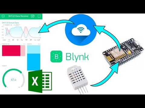
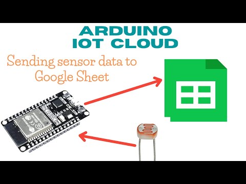
How to display graphs of 4 sensors with Arduino IoT Cloud, Webhook & Google Sheet? To display graphs of more than 2 sensors on Arduino IoT Cloud, an Advanced Chart widget is required, which can only be used in the paid plan features. As an alternative to this Advanced Chart, we can use a graph created with the help of Google Sheet. To make Arduino IoT Cloud connect to Google Sheet, we can use the Webhook service, which is provided for free on Arduino IoT Cloud. What are Webhooks? Webhooks are automated messages sent from apps when something happens. To use this Webhook service, we only need to fill in the Webhook link on the Things page. The interesting thing is, this Webhook link can be created easily, with the help of the Webhooks for Sheets Add-on (thanks to the creator of the Webhooks for Sheets Add-on). Here are the steps: 1. Open this wokwi project: 2. Repeat creating Thing and Dashboard on Arduino IoT Cloud according to this video: 3. Open Google Sheet, install Webhooks for Sheets Add-on. 4. Create a Webhook link, authorize with a Gmail account. 5. After the Webhook link has been successfully created, enter the Webhook link in the Set Webhook column on the Thing page in Arduino IoT Cloud. 6. Run the Wokwi simulation. Don't forget to change the ID code and Secret Key of the newly added device. Every time there is a change in the value of one of the Cloud variables on the Thing page, it will send the value of that variable to the Google Sheet. Note: Don't change variable values too quickly and frequently, because it will break the Webhook. Try to make changes, from one change to the next, at intervals of no less than 10 seconds. This setting applies not only to changes to the sensor, but also changes to the Relay control, because the Webhook link will make every change to the Cloud variables on the Thing page (including the variables: schedule, select_1, select_2, set and text), sent to Google Sheet. 7. Once the variable value data appears in the Google Sheet, delete unnecessary data to save memory. Separate the sensor values by commas, and convert the timestamps into time values in seconds to create the X-axis values. Note: To save memory, delete all columns, leaving only 3 columns with column names: values_0_name, values_0_value and values_0_updated_at, place these three sequentially in columns A, B and G. Sheet:1, Cell: C2 =arrayformula(if(B2:B="","",split(B2:B,","))) Sheet:1, Cell: H2 =arrayformula(if(G2:G="","",split(G2:G,"TZ")+7/24)) Note:+7/24 for Jakarta time zone Sheet:1, Cell: J2 =arrayformula(if(H2:H="","",value(H2:H)+value(I2:I))) Sheet:1, Cell: K2 =arrayformula(if(H2:H="","",(J2:J-$J$2)*100000)) Sheet:2, Cell: A1 =unique(Sheet1!A:K) Sheet:3, Cell: A1 =query(Sheet2!A:K,"select K,C,D,E,F where K is not null order by K asc") 8. To make only variables containing sensor values appear in the Google Sheet, create data validation in the values1 column, which is only valid if the data contains "text", otherwise it is rejected 9. With webhooks, some of the same values can appear multiple times. To only display unique values, add a Sheet page, use the Unique function in Google Sheet to make only unique values display. 10. Add another sheet page, and use the Query function to retrieve time data in seconds, followed by the values of the four sensors one by one, starting from NTC, LDR, Rotary and Slide potentiometer. Create a graph in Google Sheet by selecting the time column and the four sensor columns followed by inserting a Chart. Click on the menu in the chart (3 vertical dots), select Publish Chart to display the chart on the Web. For further information, please visit this blog: #tujuh
- 1726Просмотров
- 1 год назадОпубликованоdian artanto
How to display graphs of 4 sensors with Arduino IoT Cloud (free plan), Webhook & Google Sheet?
Похожее видео


Популярное
Новини