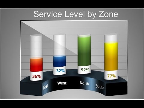
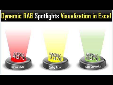
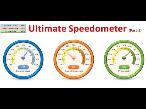
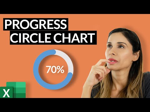
#KPICharts #ExcelInfograhics Hello Friends, In this video, you will learn how to create a beautiful Group of Circle Charts. In this Group of Circle Charts, we have displayed Market level and Over all service level. You can use it in your business dashboard or prestation. Click here to download the practice file: Download our free Excel utility Tool and improve your productivity: See our Excel Products: Visit to learn more: Chart and Visualizations: VBA Course: Download useful Templates: Dashboards: Watch the best info-graphics and dynamic charts from below link: Learn and free download best excel Dashboard template: Learn Step by Step VBA: Website: Facebook: Telegram: Twitter: Pinterest: Send me your queries on telegram: @PKanExcelExpert ************* Suggested Books ********* VBA: Excel Dashboard: Power Query: Power Pivot and Power BI: Exam Ref 70-778 (Power BI): ************* My Stuff **************** Mic : Video Editor:
- 142311Просмотров
- 6 лет назадОпубликованоPK: An Excel Expert
Info-graphics: Group of Circle Charts in Excel
Похожее видео


Популярное
Новини