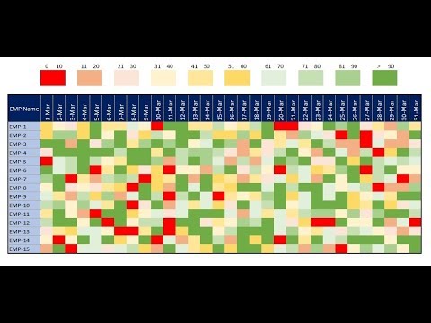
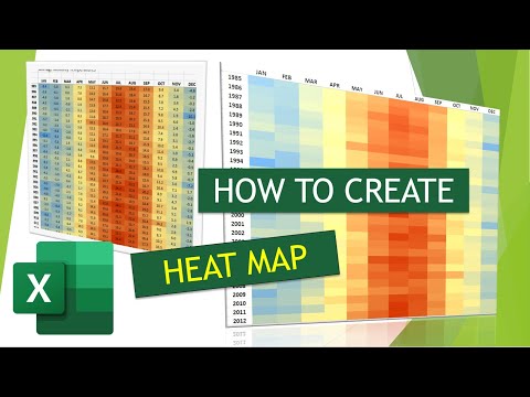
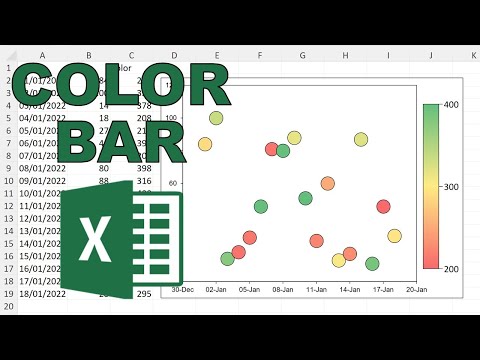
In today’s tutorial we’re going to have a look at how to create a heat map in Excel, which comes quite handy when you’d like to provide a clear overview of data in terms of the highest, lowest, and middle values. Ready? Don’t miss out a great opportunity to learn: How to Visualize Data in Excel ► =============== ❤️ Become a Patron: Do you find our tutorials useful? Join this channel and become a patron YouTube ► @ExcelTutorialsEasyClickAcademy/join =============== ⏱️Timestamps⏱️ 0:00 Intro 0:30 How to Create a Heat Map in Excel 1:32 How to Edit a Heat Map in Excel 1:33 How to Remove a Heat Map in Excel ================ Is this your first time on EasyClick? We’ll be more than happy to welcome you in our online community. Hit that Subscribe button and join the EasyClickers! :) ► Transcription How to Create a Heat Map in Excel (Quick and Easy) ► Got Microsoft Office 365? Get it here ► Connect: LinkedIn ► Facebook ► Screen Recorder & Video Editor: Camtasia ► #MicrosoftExcel #ExcelQuickAndEasy #EasyClickAcademy
- 24462Просмотров
- 3 года назадОпубликованоExcel Tutorials by EasyClick Academy
How to Create a Heat Map in Excel (Quick and Easy)
Похожее видео


Популярное
Новини