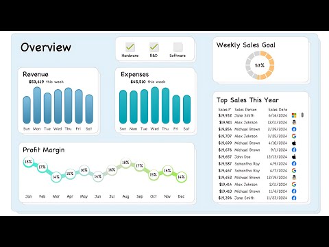
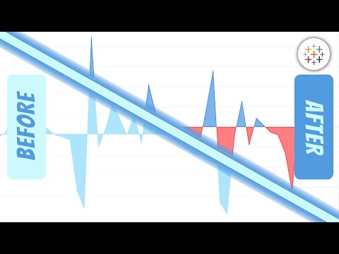
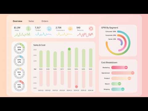
Learn how to create a conditional coloring gradient area chart in Tableau and how to set up a toggle button to switch between two metrics, like price and volume. When a metric is selected, the area chart updates to display the chosen metric, and the toggle button and label colors match the gradient area chart’s coloring. This technique enhances the visual clarity and interactivity of your Tableau dashboards, providing users with an intuitive way to explore different metrics. Tableau: Teal Gradient: Green Gradient: Excel: Norm Metric: (SUM([Price]) - WINDOW_MIN(SUM([Price])))/ (WINDOW_MAX(SUM([Price])) - WINDOW_MIN(SUM([Price]))) Norm Metric - Multiple Metrics: (SUM([Pivot Field Values]) - WINDOW_MIN(SUM([Pivot Field Values]))) / (WINDOW_MAX(SUM([Pivot Field Values])) - WINDOW_MIN(SUM([Pivot Field Values]))) Reversed Metric: 1 - [Norm Metric] Norm Date: (MIN([Date]) - WINDOW_MIN(MIN([Date]))) / (WINDOW_MAX(MAX([Date])) - WINDOW_MIN(MIN([Date])))
- 1086Просмотров
- 1 год назадОпубликованоGolden Insights
Step-by-Step Guide: Gradient Area Charts with Conditional Coloring in Tableau
Похожее видео


Популярное
Новини