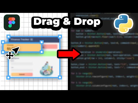
UPDATE: The layout of Figma has slightly changed after recording this video. The create new design file button is at the top right-hand corner, and the settings button is under the profile icon at the top left-hand corner. Need a beautiful dashboard in Python but don't know how to create one? In this video, I'll go over how to make a dashboard in Python using TkinterDesigner to create the UI with the drag-and-drop interface in Figma. We'll also use Matplotlib, a powerful graphing library, and go over how to create a table. All within 15 minutes! 🎨 Color Codes: Dark Purple (For Window) - 2A2F4F Pink (For Header) - E5BEEC Light Purple (For Metrics & Containers) - 917FB3 Light Green (For Icon) - D9FFCA Purple (For Centre Container) - 5F4A87 🔗 Links: TkinterDesigner - Dummy Data - Completed Code: Recommended Matplotlib Tutorial Series: Learn More About Matplotlib: TkinterDesigner Documentation: Matplotlib Colors: #css-colors 📚 Chapters: 00:00 - Intro 00:14 - Creating UI 04:13 - Converting UI To Code 05:13 - Adding Area Chart 09:44 - Adding Circular Bar Chart 12:36 - Adding Table Comment below for suggestions & feedback!
- 152970Просмотров
- 2 года назадОпубликованоTurbineThree
Make Modern Python Dashboards With Tkinter & Matplotlib!
Похожее видео


Популярное
Новини