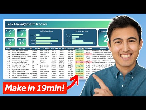
✅Download the free course files and follow along here: ➡️ Learn how to create stunning data visualizations in Excel using tables, slicers, and charts with the help of free practice files. This tutorial covers column charts, pie charts, sparklines, and pivot tables while showing you how to connect them into a simple interactive dashboard. By the end, you will know how to transform raw data into clear, engaging visuals that facilitate analysis and reporting. 📝 Use the timestamps below to navigate to different sections of the course. If you already know one of these topics, skip ahead! 00:00:00 - Course Introduction 00:01:18 - Column Charts 00:18:05 - Pie Charts 00:21:37 - Slicers 00:28:22 - Sparklines 00:34:31 - Pivot Tables 00:37:42 - Create a Simple Dashboard 🌍 Get unlimited training with Simon Sez IT’s 200+ courses ⏩ 🚀 Supercharge your skills with a FREE 14-day trial to our extensive training library. Learn from 10,000+ ad-free videos and begin your transformation today! ➡️ 💻 Watch more free popular training tutorials from Simon Sez IT: 🔥Check out our FREE 400+ hour training course playlist here ➡️ 🔥 For a full training experience, check out our FREE YouTube course: 👉 @SimonSezIT/courses ✅ Microsoft Excel Tips and Tricks 👉 ✅ Microsoft Office 2021 and Office 365 Training here 👉 💬Stay in touch! : LinkedIn: FaceBook: 🔔 Subscribe to our channel: If you enjoyed the video, please give a thumbs up 👍🏽 ;-)
- 2388Просмотров
- 3 недели назадОпубликованоSimon Sez IT
How to Create Data Visualization in Excel using Tables, Slicers and Charts (Includes Free Files)
Похожее видео


Популярное
Новини